 Sign In
 Register
 Help
Help

Page 1 of 1
 Start a new topic
-
 This topic is locked
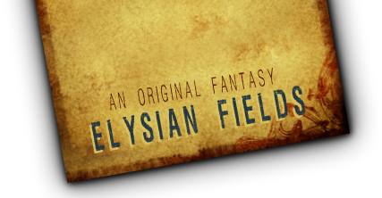
[!] Website Makeover
#1
 Eivyonydd

- A wild threader has appeared!
-

- Group: Retired
- Posts: 219
Posted 21 February 2009 - 09:48 PM
So the website looks really pretty, like seriously pretty, but I'm having a hard time reading it. The black text on the dark blue is just too hard to read. The colour of the links is really easy to read, so perhaps the text could be shifted to something similar to that.
 MultiQuote
#2
Xanth
- The Creator
-

- Group: Administrator
- Posts: 624
-
Xanth
- Looks:20
- Gender:Female
- Race:Tanakheimein
- Profile:View
- House:Pay a Visit
- Shop:Buy Something
- Karma:0
-
Emma
- Player Limits:View
- Other Characters:Dazadi, Piper, Faroah, Kiel, Maaike, Zozeko
- Muse's Inn:Visit My Gallery
- Job(s):Administrator
Posted 23 February 2009 - 01:51 AM

I think that's better, I lightened the background behind the main section a bit. Let me know if you still have problems.

#4
Xanth
- The Creator
-
- Group: Administrator
- Posts: 624
-
Xanth
- Looks:20
- Gender:Female
- Race:Tanakheimein
- Profile:View
- House:Pay a Visit
- Shop:Buy Something
- Karma:0
-
Emma
- Player Limits:View
- Other Characters:Dazadi, Piper, Faroah, Kiel, Maaike, Zozeko
- Muse's Inn:Visit My Gallery
- Job(s):Administrator
Posted 23 February 2009 - 03:13 AM
Er, lightened a bit more. I'm wondering if there's a browser resolution issue here, too, though, because it doesn't look bad on my computer. *strokes chin thoughtfully*
Page 1 of 1
- Start a new topic
-
This topic is locked